THE CHALLENGE
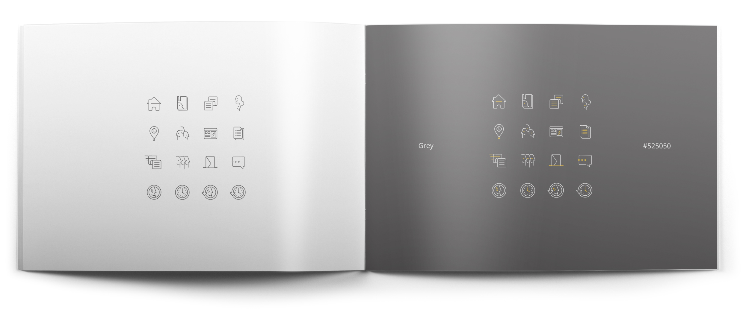
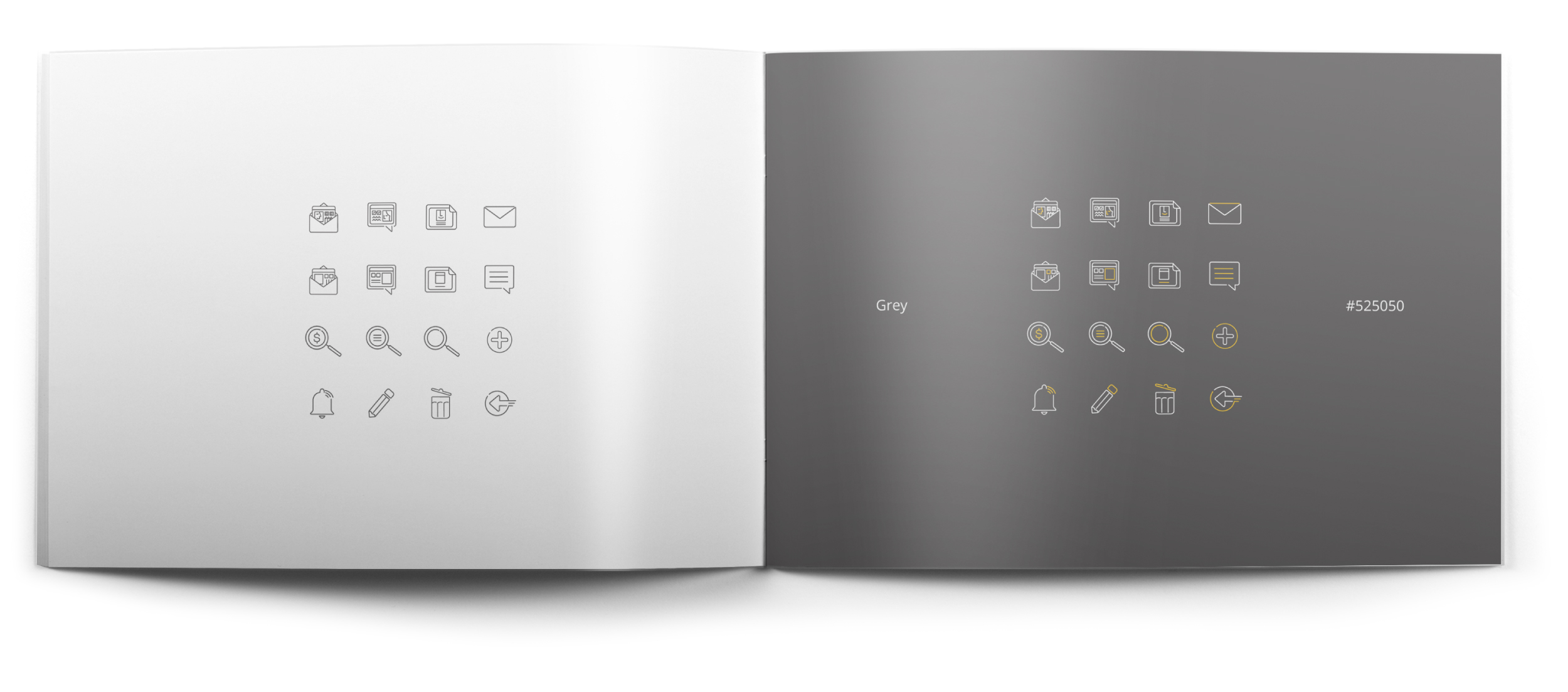
Mooney, a leading fintech company in Italy, needed us to create an illustrated icon set for their payment link management web application. The icons had to be immediately understandable and convey their meaning clearly and uniquely at a glance.

OUR INTERVENTION
The goal was to create an icon system that was not only visually appealing but also clear, immediate, and in line with the Mooney brand.
The process of study and creation included: analysis of colors, shapes, and lines to develop a digital mood board representing the desired atmosphere and style for the icons; defining the icon grid, sketching, digitizing, and refining to achieve a clean and professional aesthetic; selecting a color palette consistent with the Mooney brand and mood board, using colors to convey emotions, actions, and categories; carefully reviewing the icons to improve their clarity, effectiveness, and coherence with the overall design of the web application; creating a style guide and integrating the icons into the web application to ensure perfect compatibility and optimal use; testing to evaluate the usability and effectiveness of the icons, making necessary optimizations to enhance the user experience.
The result is a set of icons that balances aesthetics, clarity, and consistency with the overall design and communication goals of the platform.


