THE CHALLENGE
The Rome and Province Bakers' Association, with its long tradition, entrusted us with the task of creating a visual identity that reflected the soul of Roman bread-making. Their request was clear: a logo that combined the history, quality, and innovation of the sector.
OUR INTERVENTION
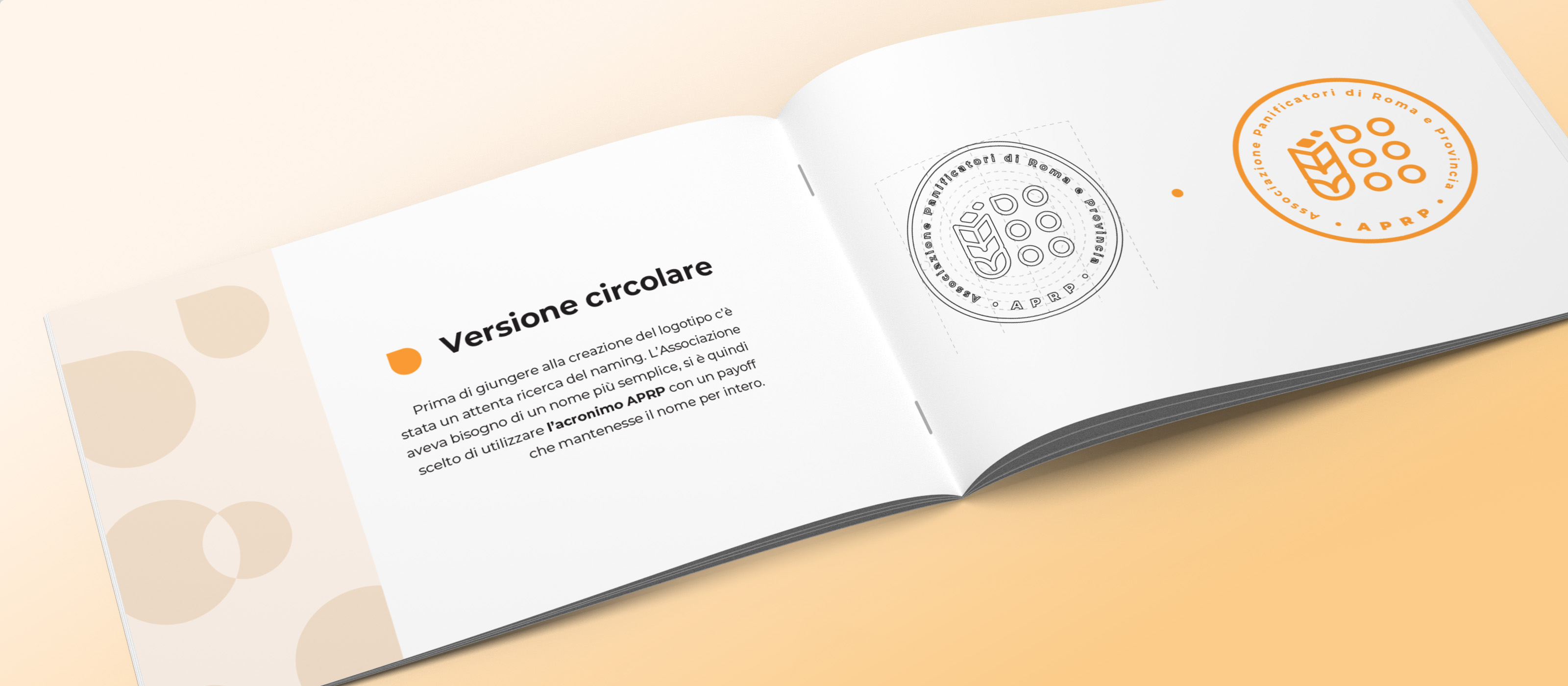
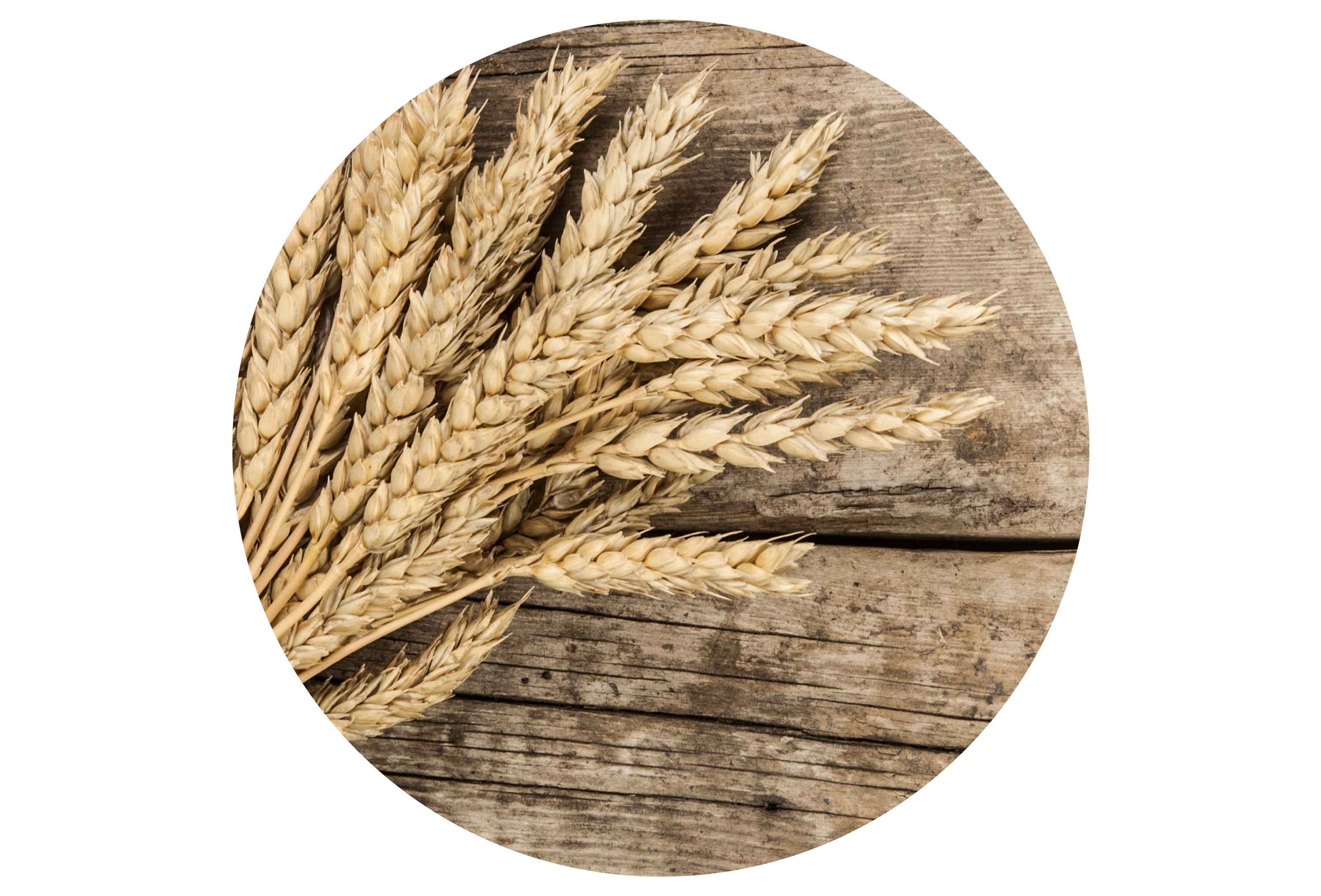
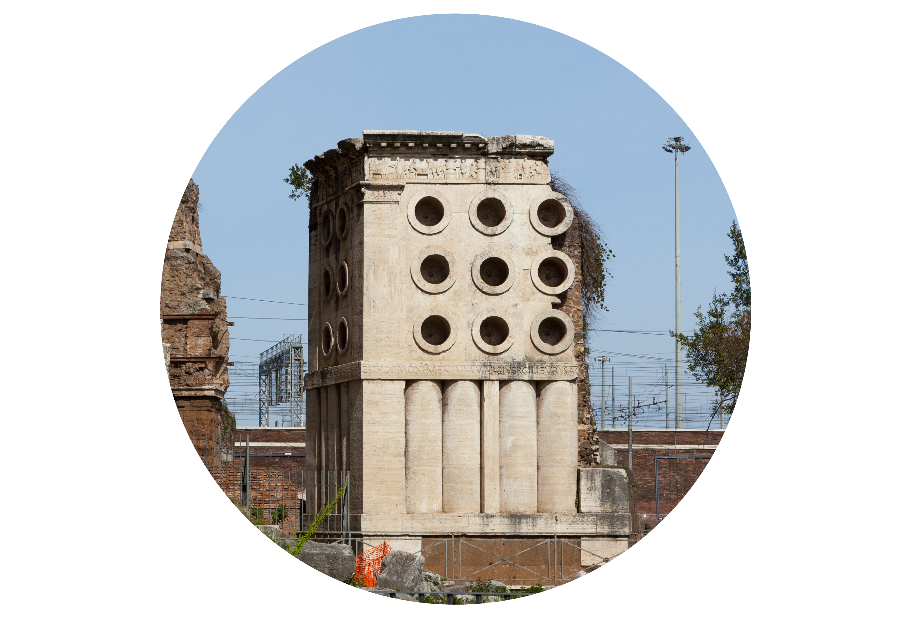
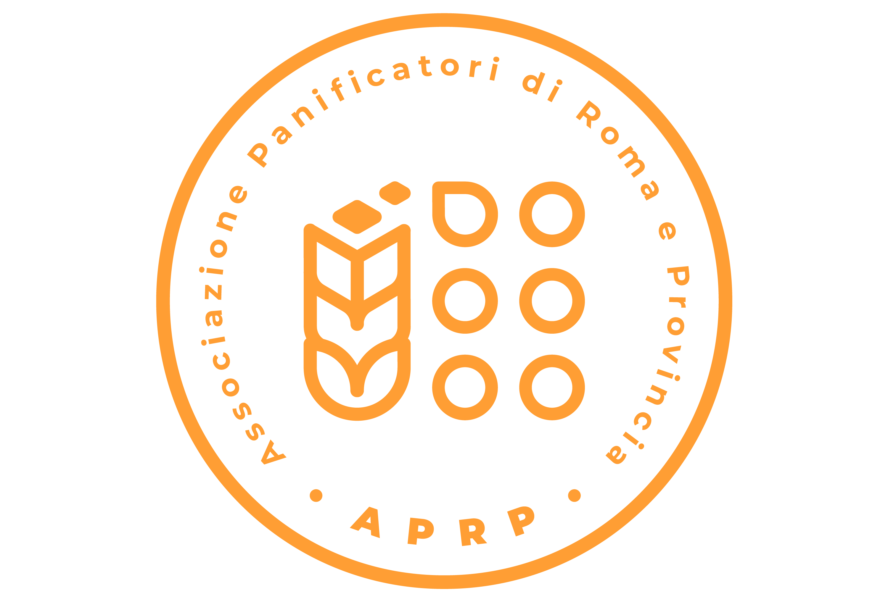
We worked closely with the APRP to create a visual identity that reflects their history and values. Through in-depth research on the history of baking in Rome, we conceived a logo that celebrates the Association's roots while looking to the future. The pictogram consists of three elements: the ear of wheat, the historical monument of Eurisace and pixels. The ear of wheat represents value and the raw material, the monument of Eurisace highlights the tradition dating back to the Roman Empire, and the pixels - embodied in the two higher grains of wheat - symbolize the evolution of baking over time. The new logo is a perfect blend of values, tradition, and modernity. With a distinctive pictogram and a warm, inviting color palette, the brand communicates the authenticity and passion of the bakers of Rome and Province, representing the history and future of the Association as it progresses with the times.


